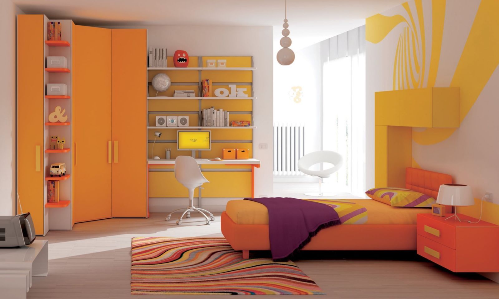
- Warm colors: Warm colors often bring abundant energy to the space, making the room more cozy and joyful such as red, orange, yellow, brown, ... You can choose hot colors. for the family's common rooms such as the kitchen, living room...
- Cold colors: Contrary to warm and hot colors, cold colors often help to make the home space cooler such as blue, green, purple, gray,... For spaces such as bedrooms, study corners, etc. Relax or work room, cool colors will work effectively in helping to balance and harmonize the space.
04 PRINCIPLES OF INTERIOR COLOR MIXING IN 2023
In design in general and interior design in particular, color schemes always play a key role in creating a harmonious and balanced space. The color scheme in the design plays a very important role in deciding the aesthetics and feng shui of the house. Through this article, let's explore with JDesign Co., LTD: "04 PRINCIPLES OF INTERIOR COLOR MIXING IN 2023":
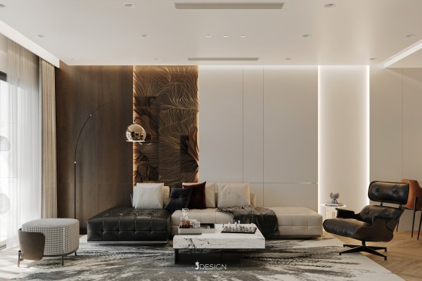
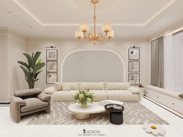
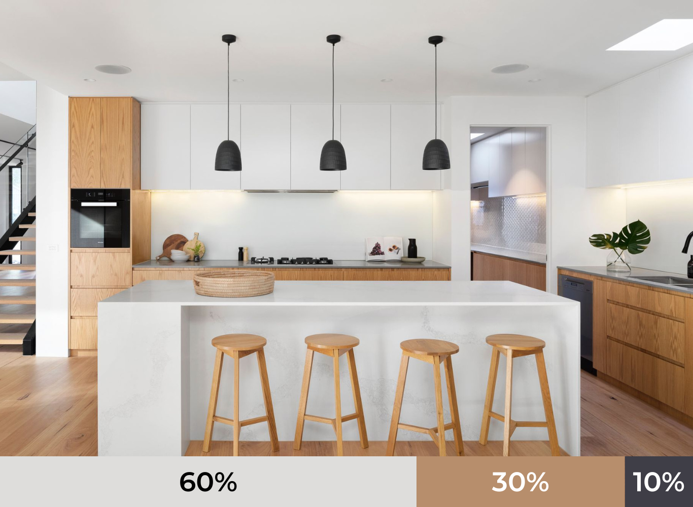
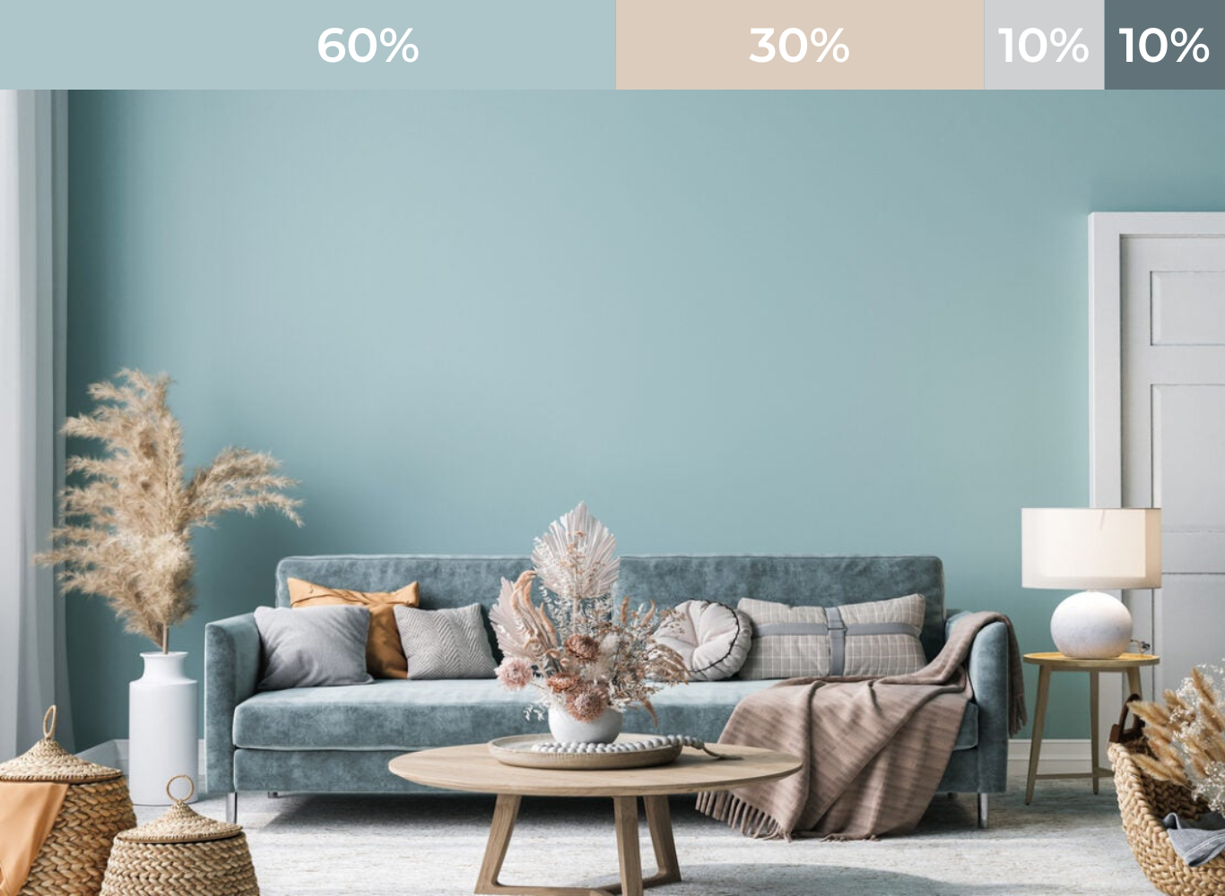
1. Rule 60-30-10:
This general design rule can be used not only for interior design but also for graphics, fashion or artwork. That's the great 60 - 30 - 10 rule based on the golden ratio.
In an interior space layout, the main color accounts for 60%, the decorative color accounts for 30%, the remaining 10% is the color used as accents.
60% dominant color - Used for large areas: walls, floors or door partitions,.... The dominant color is the basis for other colors. The main colors are usually neutral colors such as white, gray or beige, etc. to help create a harmonious scene. On the contrary, vibrant main tones will create a deeper first impression.
30% of decorative colors - Used for interior details in the house: sofas, cabinets, tables... Decorative colors are usually other neutral colors or "fake neutral" such as green, blue or yellow, ... 30% of this color will support the main color but still be different enough to create character and interest for the space.
10% accent color - Used for small objects in the room: lights, crafts, pillows, mattresses or decorative accessories, etc. This color group helps to create an impression and break the monotony of the space. time. With this 10%, make sure you're arranging the furniture evenly in the room but don't overdo it to get past the 10%.
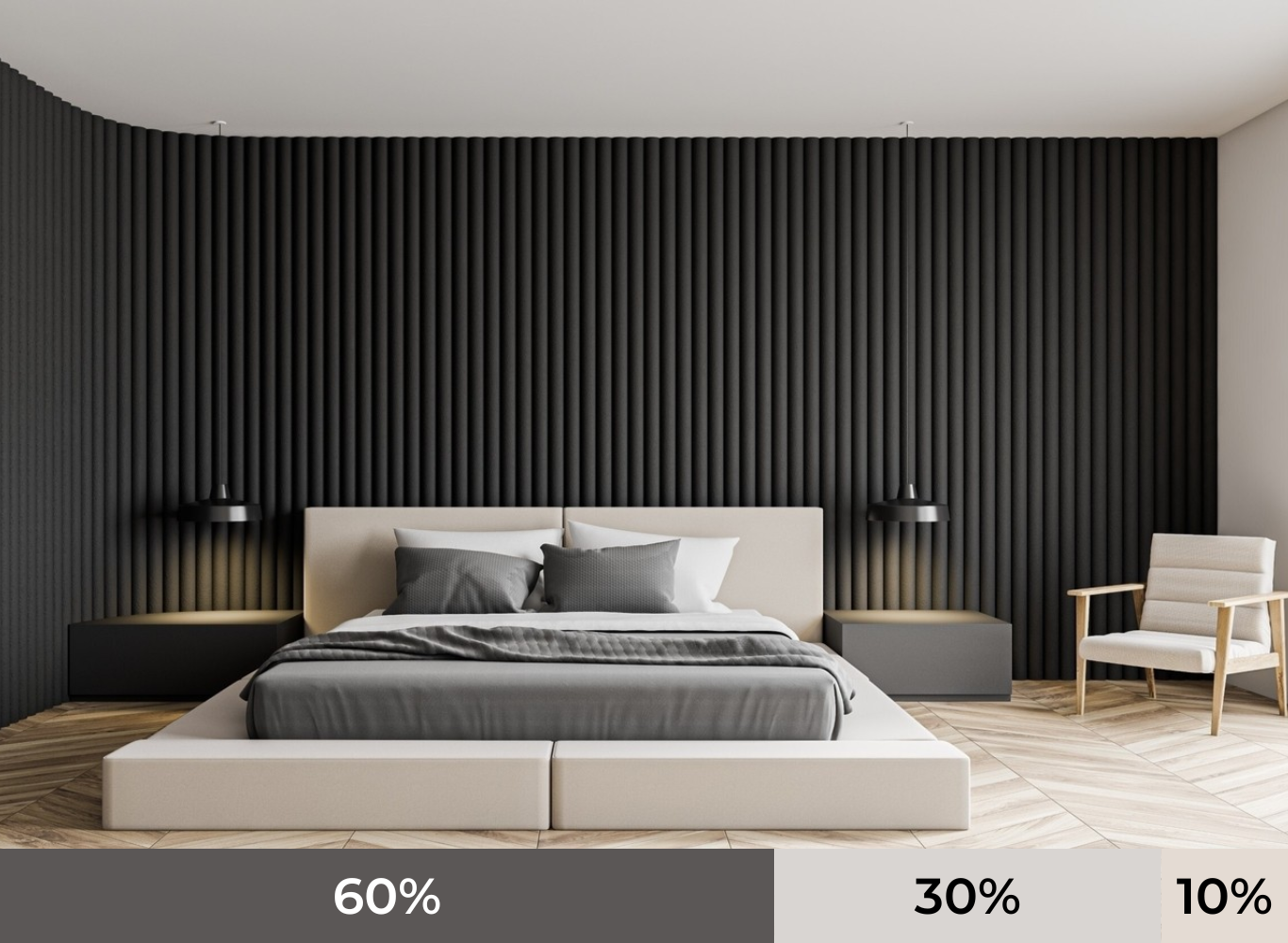
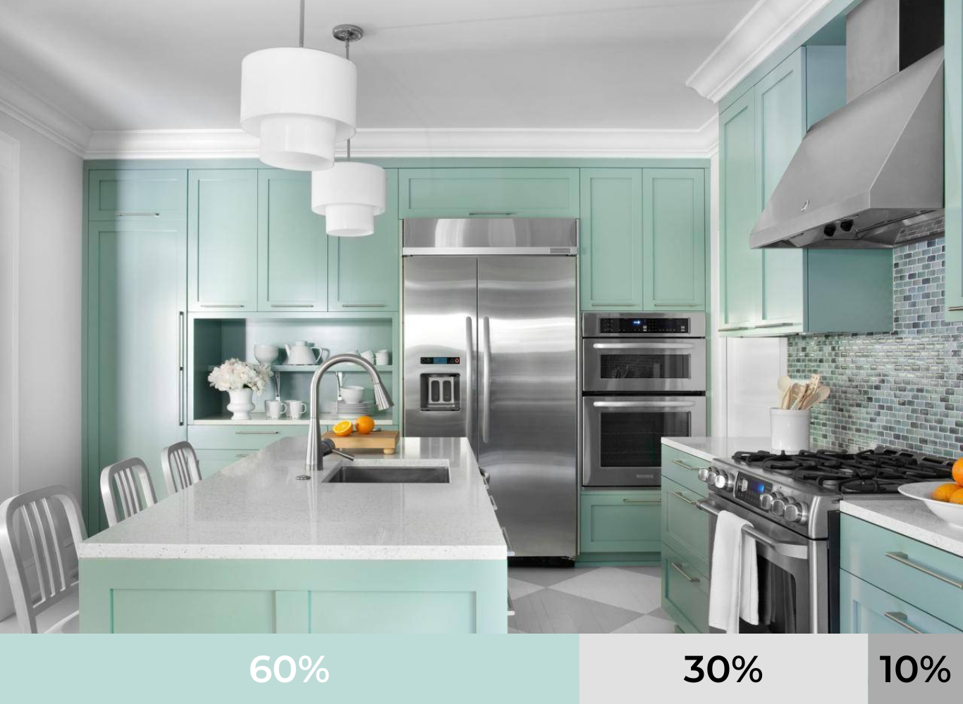
And when you want the space to become more colorful, you can adjust the formula relatively according to the 60-30-10-10 rule.
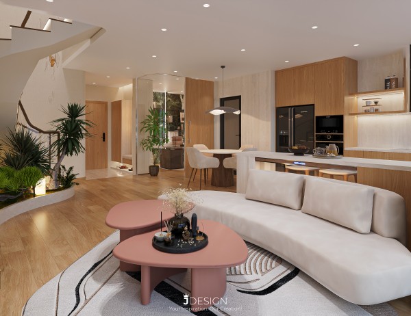
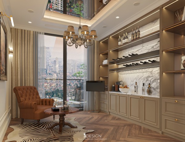
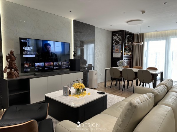
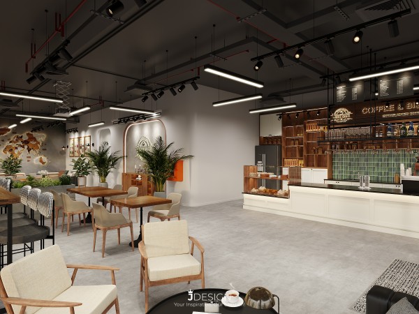
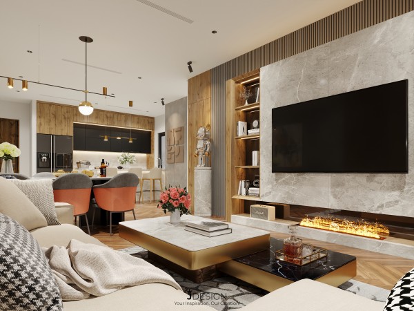
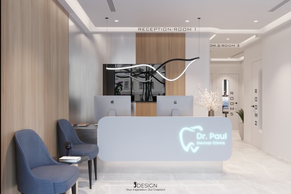
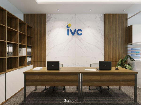
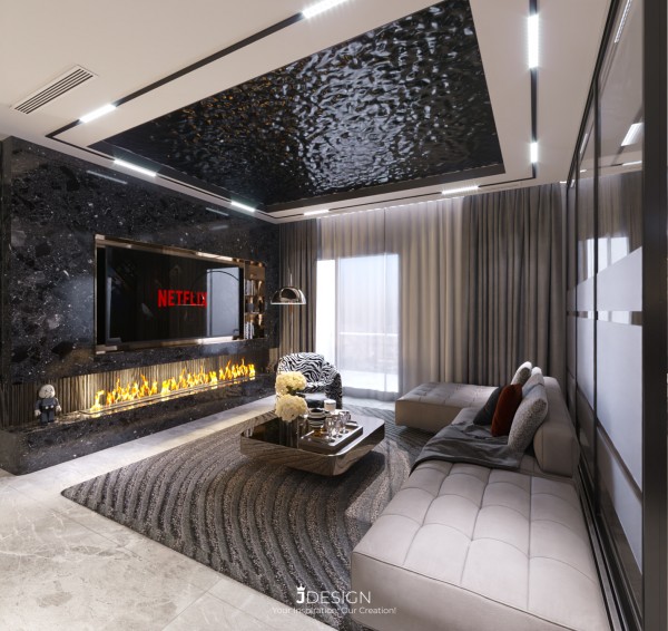
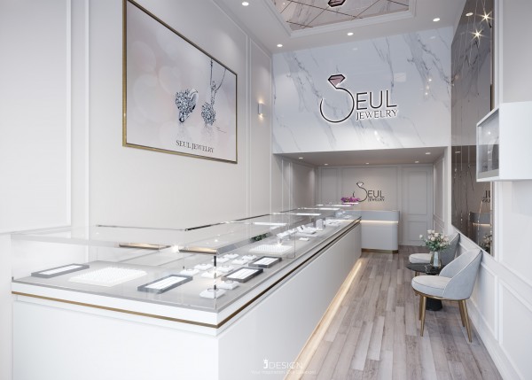
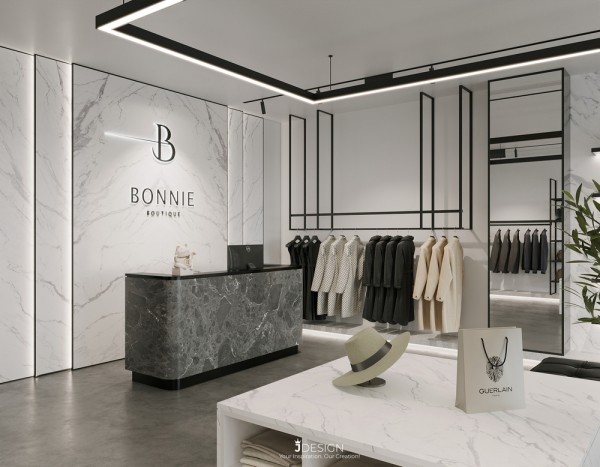
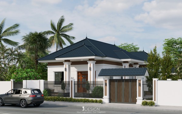
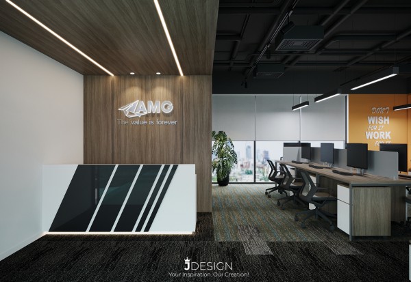
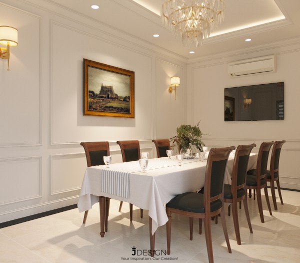
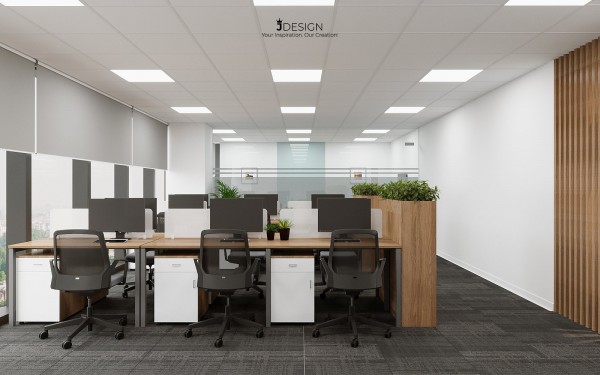
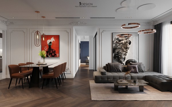
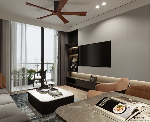
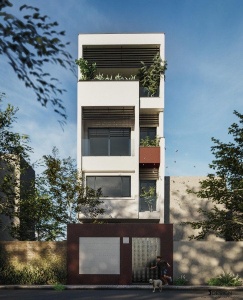
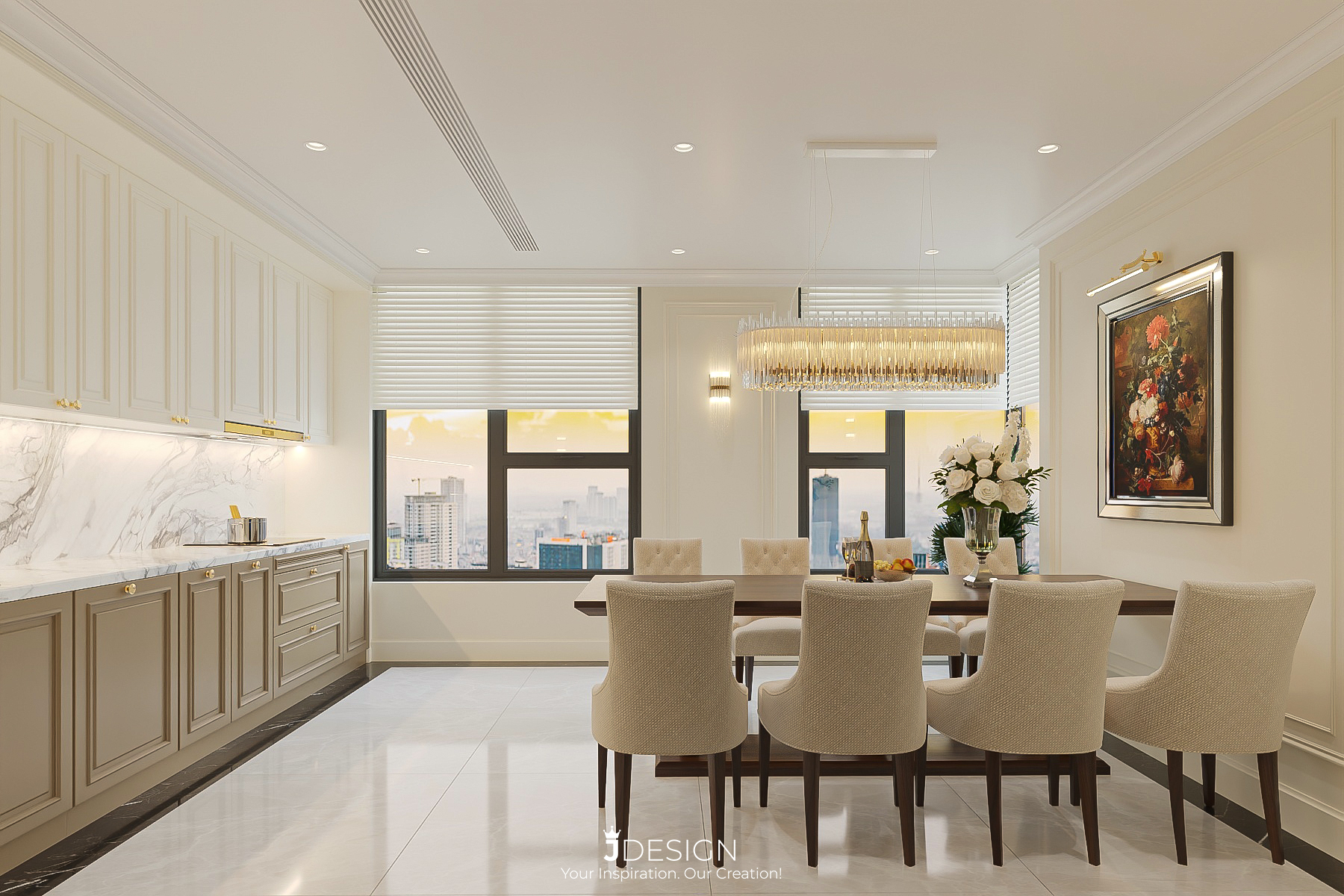
See more at: https://j-design.vn/du-an/brg-diamond-residence-english.html
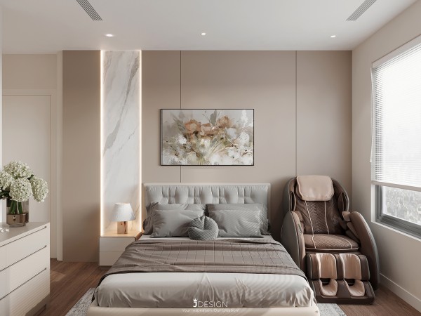
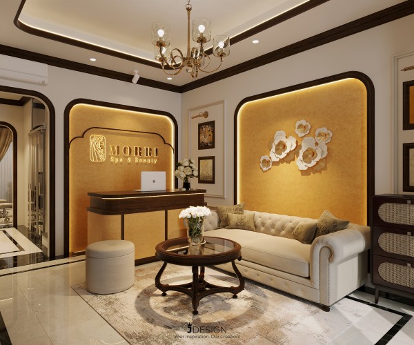
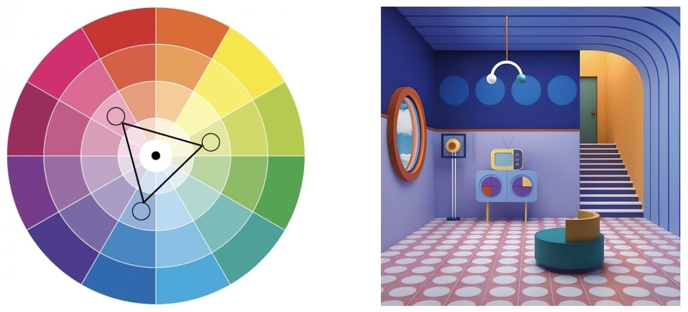
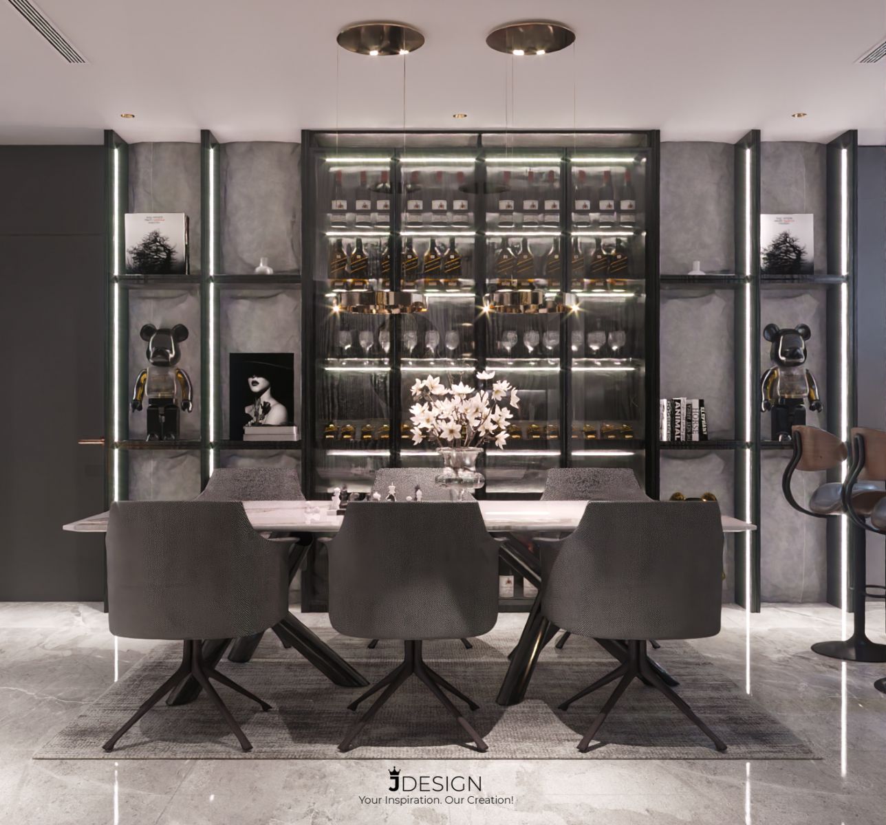
2. Mix hot and cool colors:
The choice of colors is also extremely important, because they have a great influence on each space in the house.
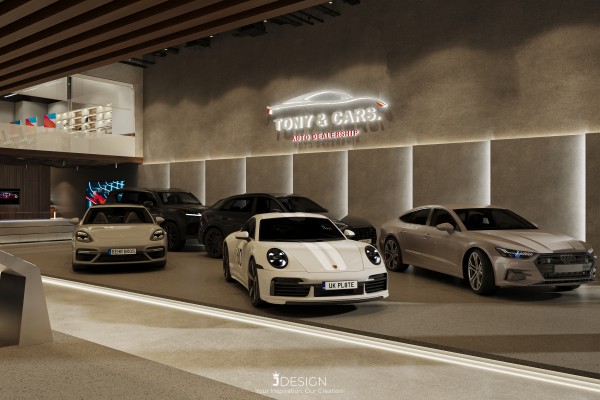
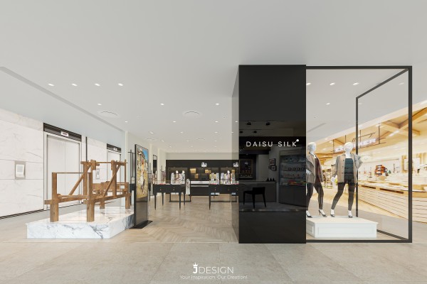
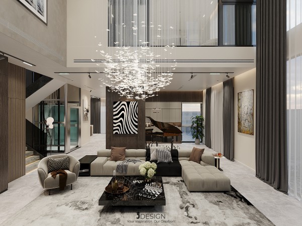
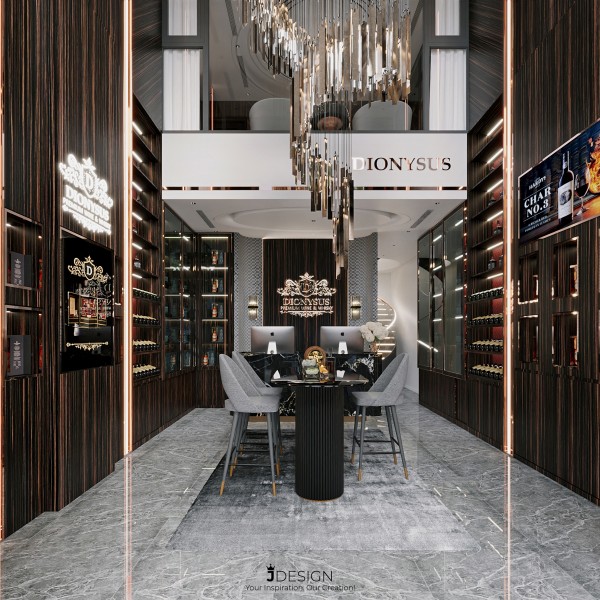
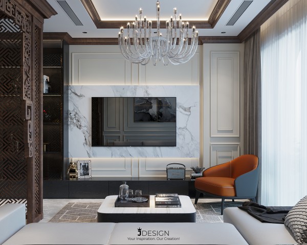
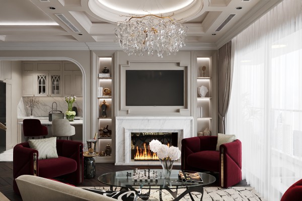
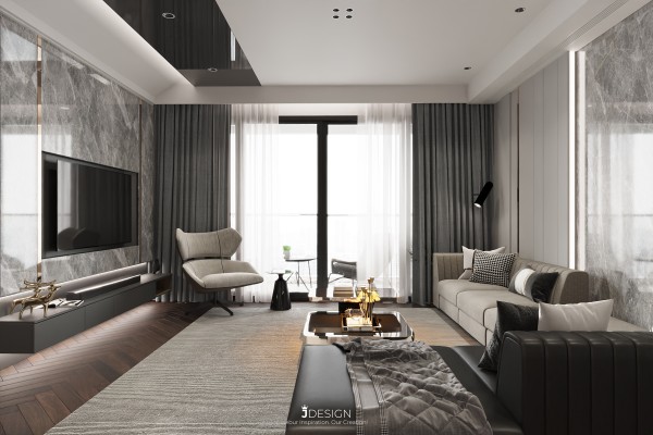
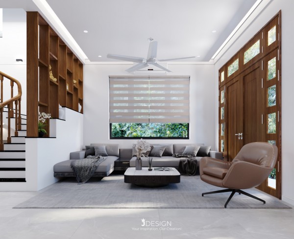
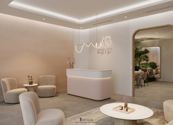
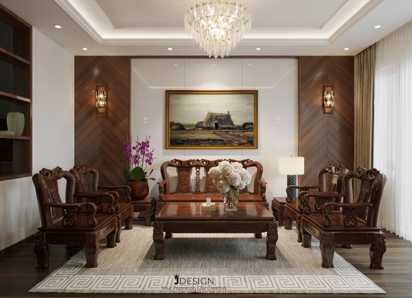
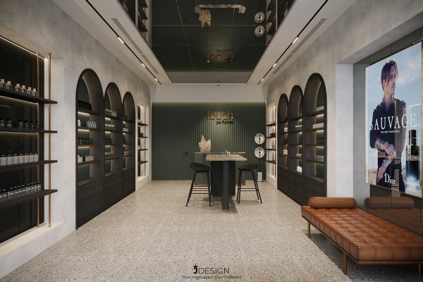
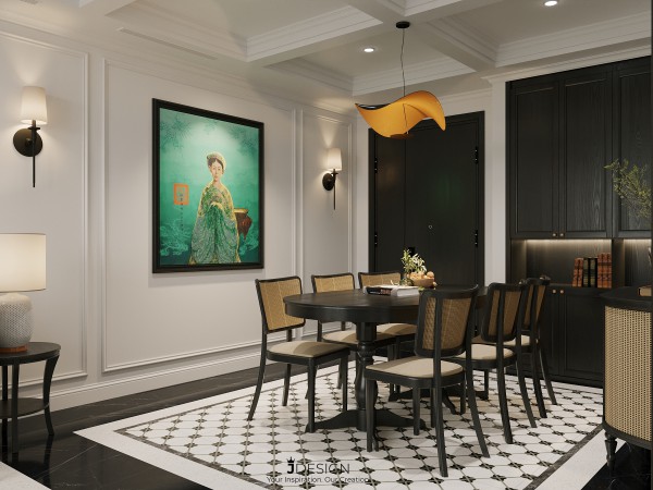
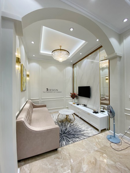
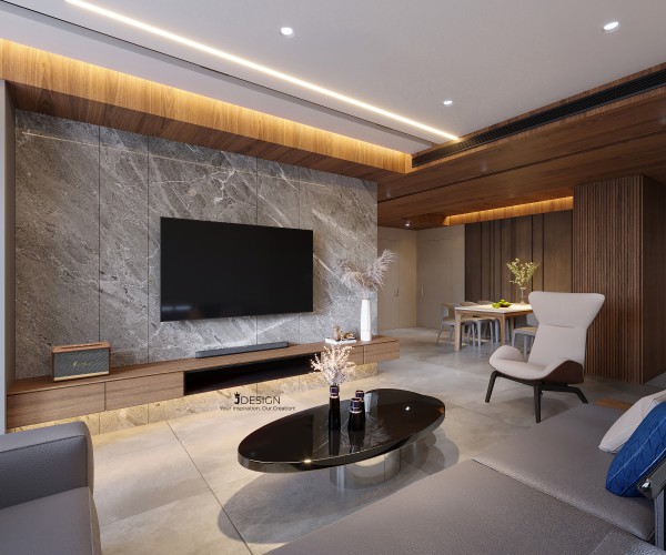
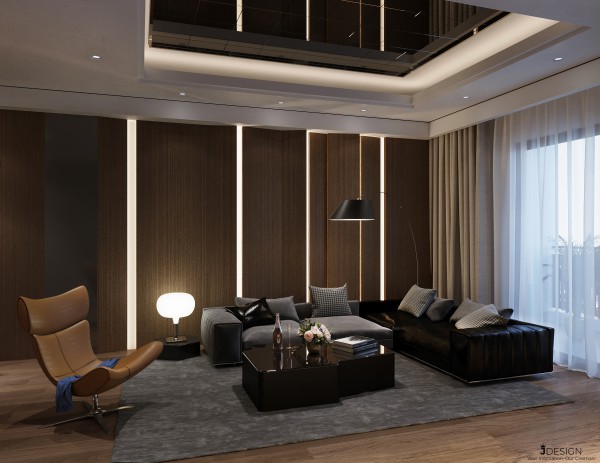
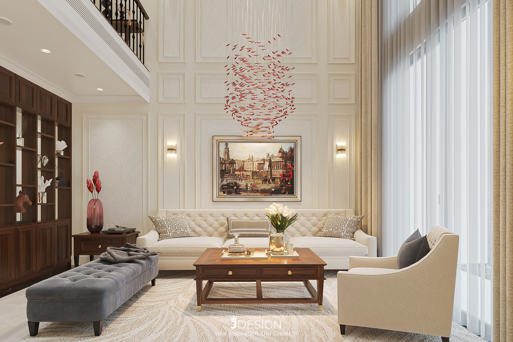
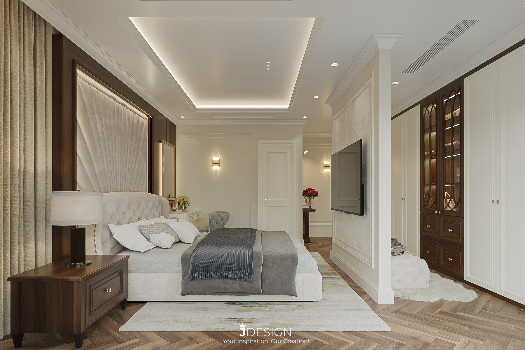
See more at: https://j-design.vn/du-an/lovely-home-vinhomes-smart-cityy.html
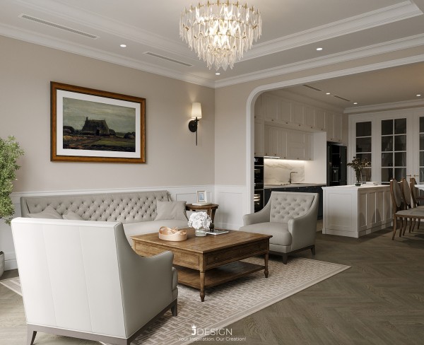
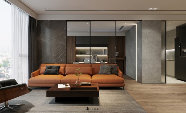
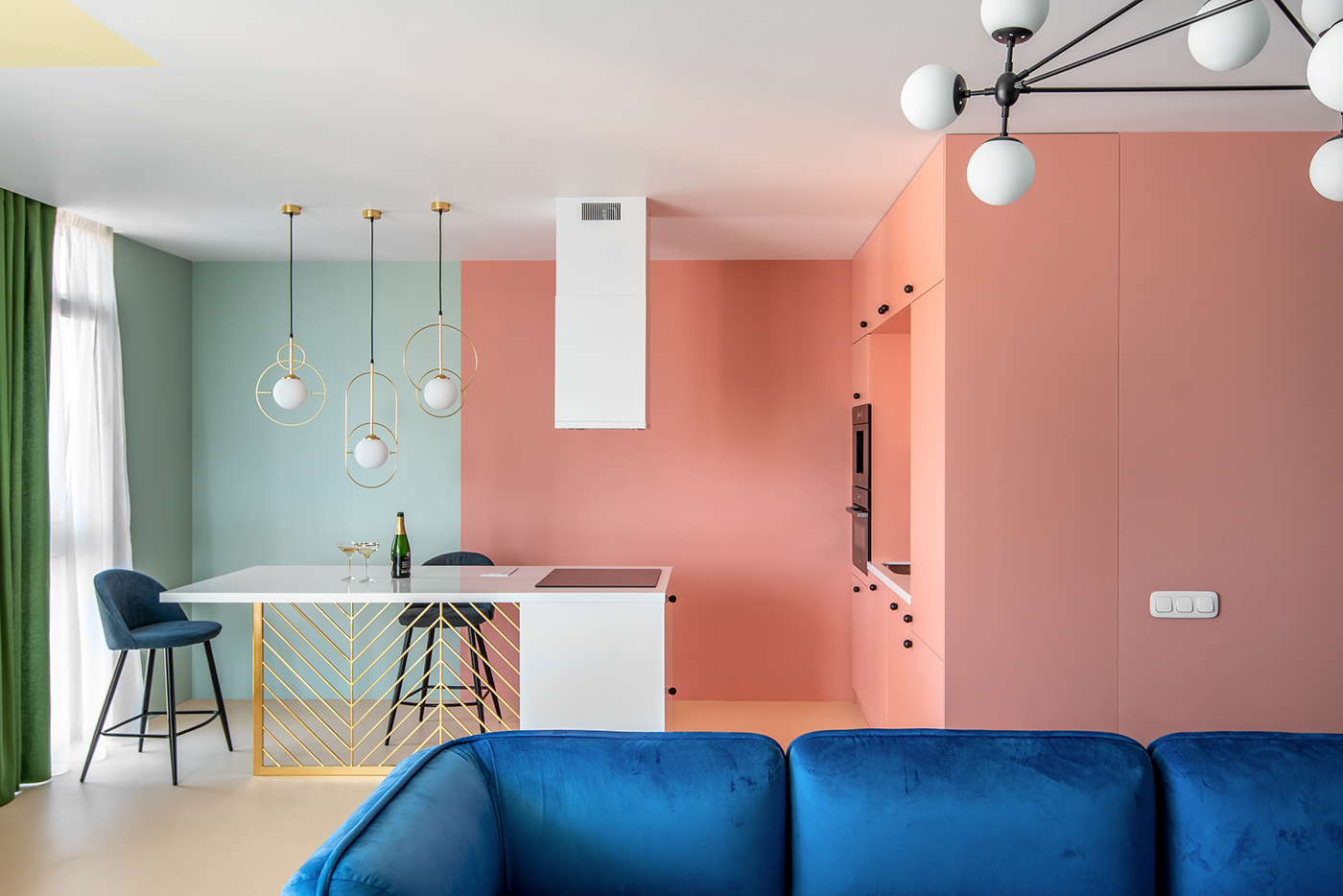
3. Contrast color scheme:
Contrast color scheme is the simplest interior color scheme. This color scheme requires you to choose the opposite color of your pre-selected main color, the symmetrical colors it is used as the secondary color. A note of contrasting color schemes is, do not use colors with light shades because the contrasting effect will not be obvious.
However, when combining such vibrant contrasting colors, you should only use it as an accent color. Also, balance these vibrant colors with neutrals to create harmony as well as give the eye a rest.
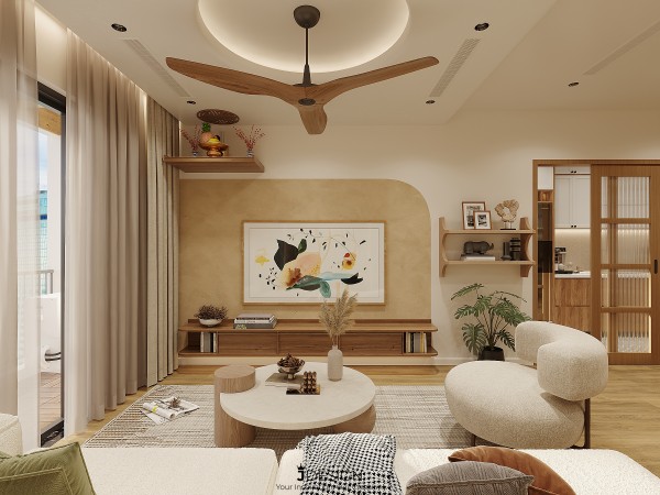
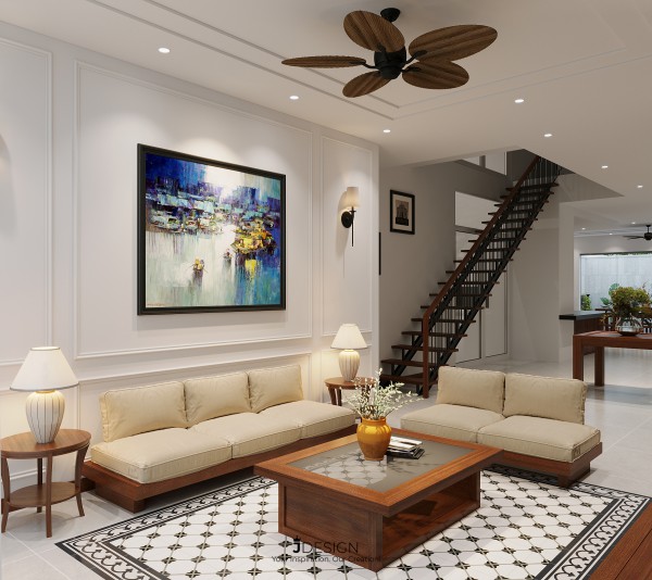
4. Similar color scheme:
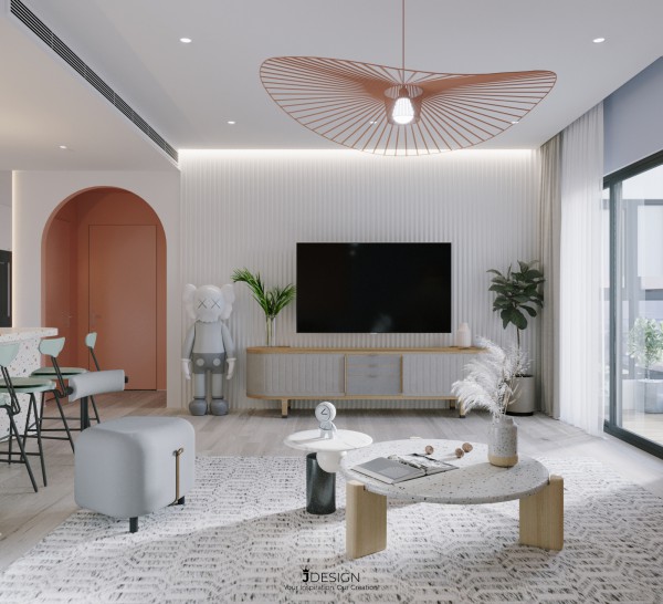
This color scheme uses a dominant color mixed with colors adjacent to it (usually 3 colors) on the color wheel. Colors that are close to each other will complement each other, creating a beautiful fade effect. For example, to apply the color scheme in the living room, experts try to combine daffodils, green vases and orange tablecloths to make the room color more prominent.
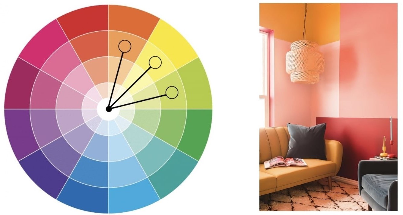
When using three colors side by side, you need to properly scale the color of the room to ensure balance and harmony. Remember the 60 - 30 - 10 rule to keep the ratios under control. In particular, remember, you can always use different shades of the same color to create visual diversity. On the color wheel, color shades fade in order from outside to center.
Alternatively, if you don't like bright colors, you can completely use neutral colors (black, white, gray) - called a monochrome palette. All you need to do is mix black and white together to get the color you want. Often colors mixed from neutral colors will be suitable for modern and youthful architectural spaces.
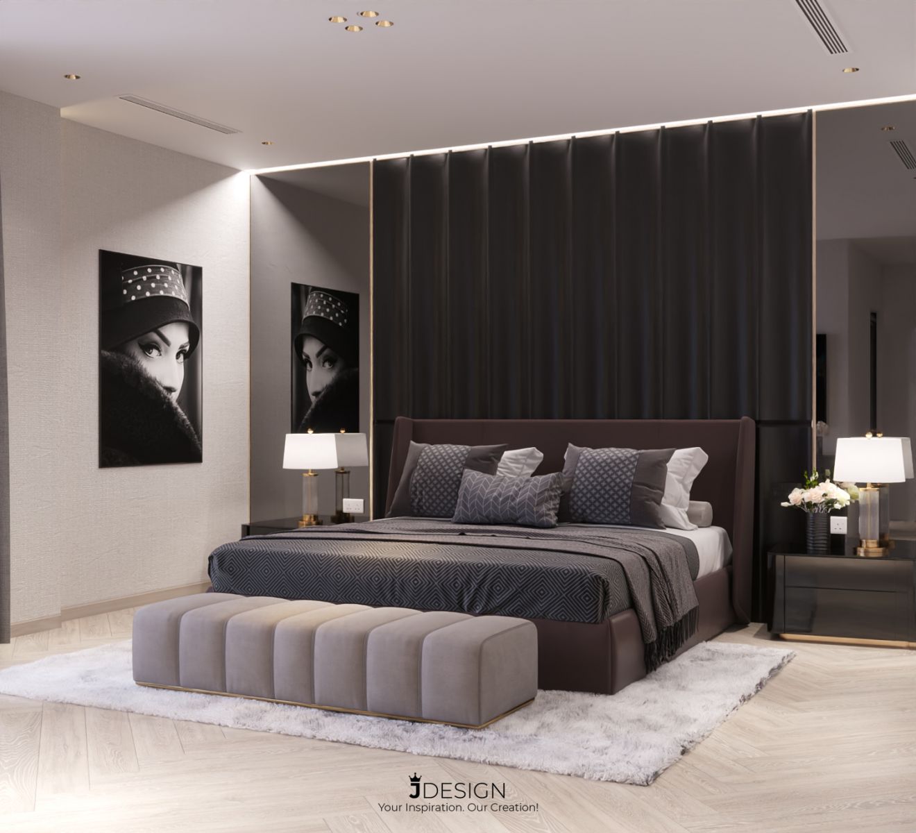
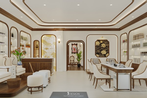
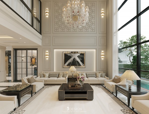
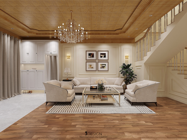
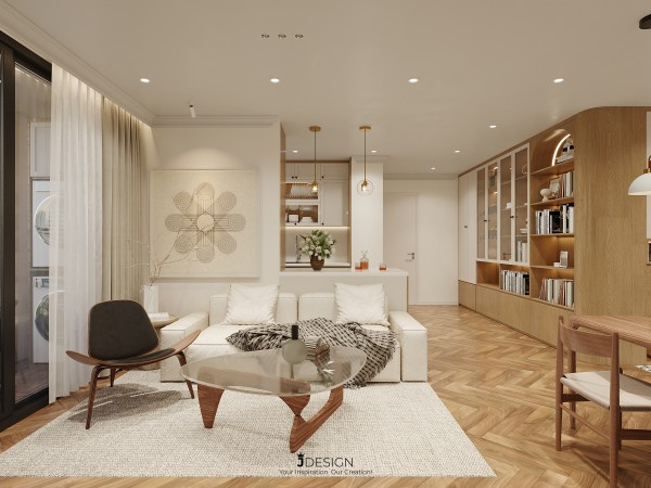
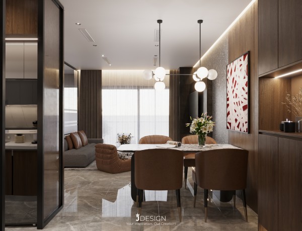
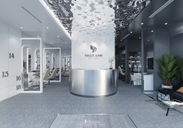
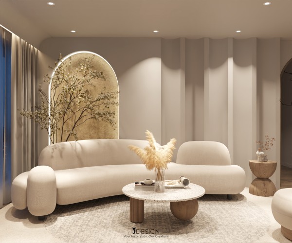
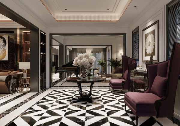
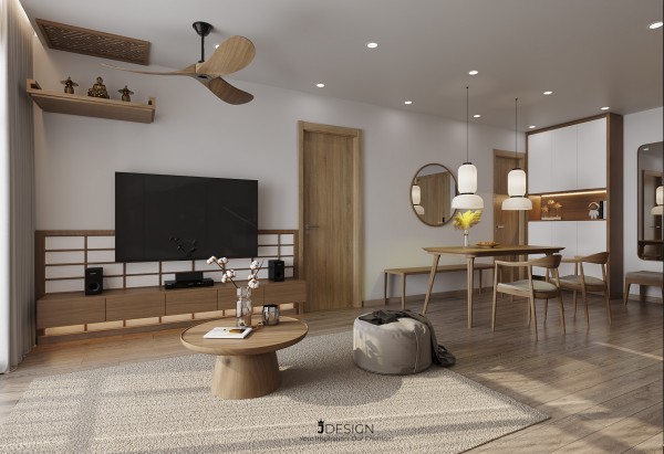
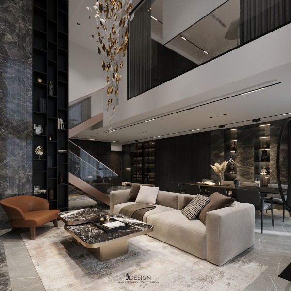
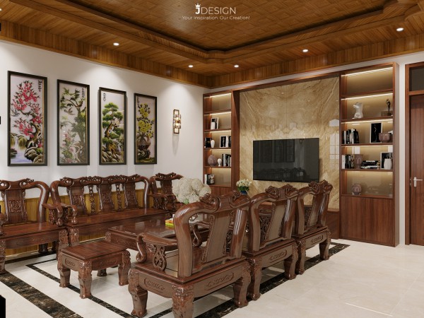
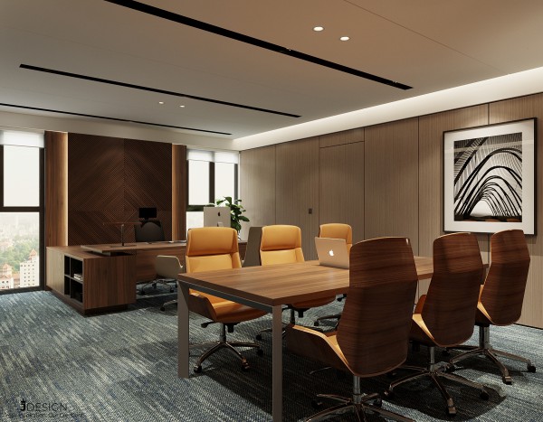
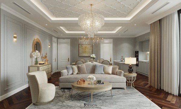
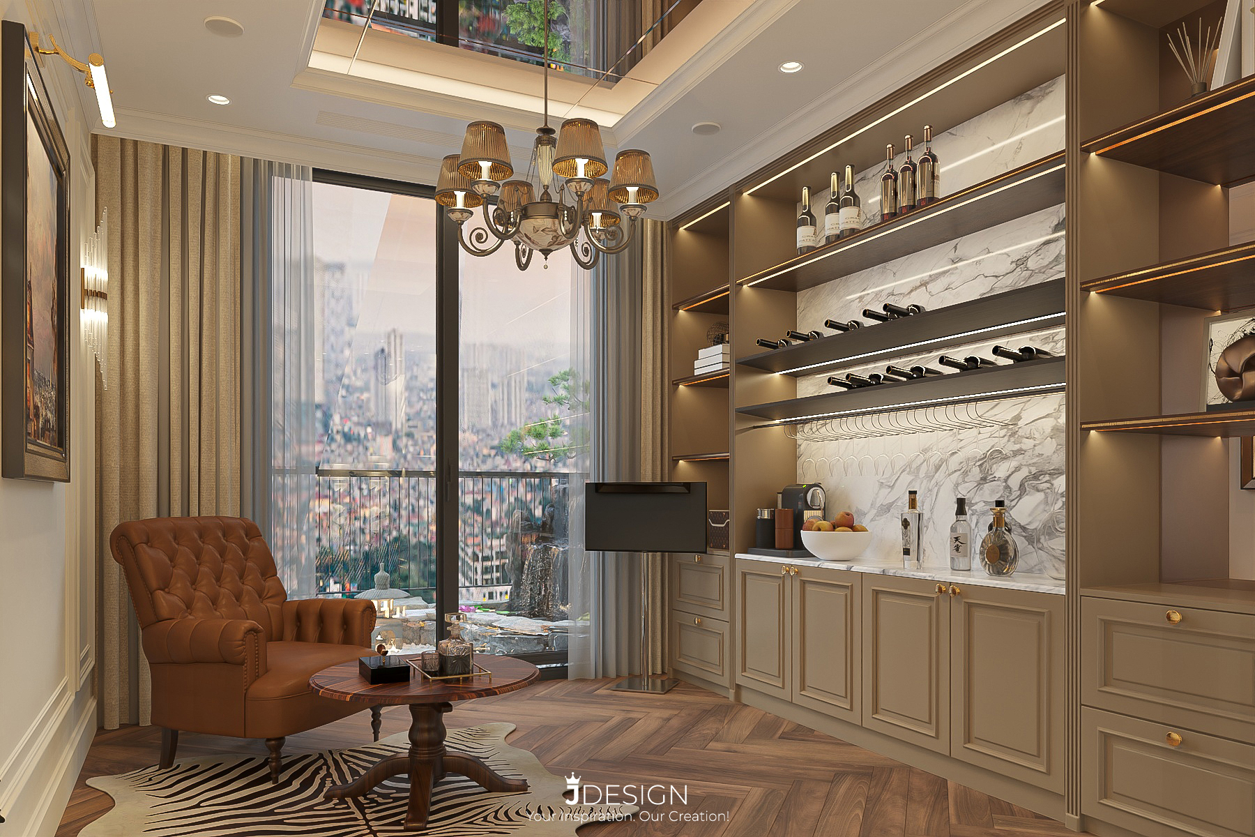
See more at: https://j-design.vn/du-an/the-legend-penthouse1.html
In interior design there are many different principles of color coordination , but the above are the 04 most basic principles that homeowners must know to work with architects to design the interior of apartments, apartments, individual style villas, special, personality, luxury and modern.
JDesign Co., LTD is proud of being a professional Interior Design and Construction Company. We are confident to always bring to our customers the complete Interior Design and Construction solution with the best designs and the latest trends, besides the quality of completing the Project with the most reasonable time. with the most economic cost, always accompanied by the condition of product maintenance support during and after the best project handover time to customers!
------------------------------------------------------
JDesign Co., LTD - PROVIDE PACKAGE SOLUTION RELATED TO INTERIOR DESIGN AND CONSTRUCTION!
Contact us now to schedule a Free Consultation/Survey/Quote!
Product warranty up to 03 years – Commitment to product maintenance for life!
For more details please contact:
- Email: contact.jdesignvn@gmail.com
- Tel: (+84) 866.648.298
- Website: https://j-design.vn/
- Fanpage: https://www.facebook.com/jdesignvn
- Corporate Office: 03/50 Nguy Nhu Kon Tum, Nhan Chinh, Thanh Xuan, Ha Noi
JDesign - Your Inspiration. Our Creation!
#jdesignvn #interior #interiordesign #interiordecor #rule #color